

門之旅
電繪繪圖教學
由 於 2010-05-29 02:00 AM 發佈 (1905 查看)
在FA喜愛的畫家又放上一個關於他的電繪過程和教學
想說就放上來這兒和大家分享
不過和上一次一樣都是英文
所以在下有空再把翻譯寫上
大家目前就看著過程大約了解先吧(喂
================================================
http://www.furaffinity.net/view/3913973/
步驟一
I start with a neatral mid-tone
一開始我先放上一個中間性色調
步驟二
Then i pick a random color and block in the basic idea
然後我隨意選擇一個顔色上色快來決定我的基礎構想
步驟三
Then i start to refine the sketch a bit
然後進一步加細我的草稿
步驟四
Next, i want to clean it up a bit, so i drop the opacity of my rough sketch down
然後爲了讓畫面清晰一點,我把簡陋的草稿的不透明度降低
步驟五
i don't care the lines per se, because they'll be painted over, but i want to have a good feel for the forms in the figure
我不會很在乎線稿本身,因爲最後會被顔色覆蓋,但是我要先把角色輪廓的形象給抓好
步驟六
Next, i'll do some color and value tests to see what sort of mood and ligthing i want, and to lay a foundation for what's to come
接下來我會嘗試放上各種的顔色和明度來觀看我所需要的感覺和光暗,好爲所想要構圖打下一個基礎
步驟七
i decided to go with something a bit less bright and a bit more moody
最後我決定采取非常低的光源來表達不穩和低沈的感覺
步驟八
i drew some hibiscus to make a frame and scanned them in, then painted them in a flat red under the lines
我手繪一些蕣花,掃描後作爲圖的邊框,然後彩上紅色
步驟九
i added a few texture layers set to Overlay and Vivid Light to give the piece the look of canvars and a brighten up the colors a bit
放上一些質感圖層並調成覆蓋模式和活光模式,好讓整體有如在畫布上的表面和提高了一點亮度
步驟十
at this point, i start painting in the figure, using the biggest brush i can to block in the forms without worrying about details yet
這個步驟開始爲角色上色,並再不用事先顧慮細節方面,用上最大的筆刷來塗完整體
步驟十一
i used a Gradient Map set to Color and lowered to 15% opacity to tweak the colors of the piece, and to help unify my palette
我使用了一個梯度地圖設成彩色並把不透明度降低到15%來調整色彩的作品,好幫助我的調色板統一
步驟十二
this is what the Gradient Map looks like at 100% opacity on the normal blending mode
這是在正常混合模式維持不透明度100%情況下是所看到的梯度地圖效果(所以看圖推測作者本人用了紅黃藍的梯度地圖)
步驟十三
i keep developing the figure, gradually working to finer details
我繼續發展我的角色,逐步向更精細的細節工作
步驟十四
more modeling on his torso
繼續加強塑造他的身形
步驟十五
at this point, the figure is basically painted in
在這個步驟時,角色大致上已經完成上色
步驟十六
next up is the background, although i always try to have the background all blocked in at the same as the figure(s)
接下來輪到背景,雖然平時我都是嘗試把背景和角色同一時間一起完成上色
步驟十七
with a fine brush, i add in the water effects
隨後我把水紋和雨滴用細小的筆頭填上
步驟十八
with the painting underneath basically complete, i add a few more texture and ligthing layers to give it a bit of grain
當整副圖基本接近完成時,我會再加上一些質感和亮位的圖層來給與他一些紋理
步驟十九
the texture layers turned the colors yellow, so i use Color Balance to shift it back to blue. i tweak the saturation and add a bit of eye glow,and i'm done!
不過那些質感圖層導致了整副圖顔色偏黃,於是我用色彩平衡把他調回藍色,我調整飽和度,並爲眼睛加上一些亮光,於是我完成了!
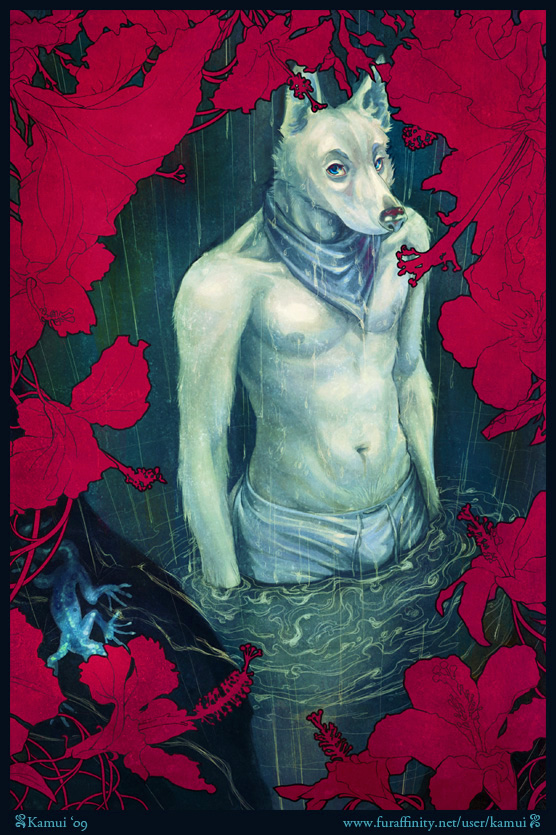
這張是完成後的圖
以上英文部分是作者的,華文部分則是照在下理解的意思去做翻譯
作者大多是用PS畫圖的,所以英文大字母部分都是Photoshop裏頭的一些圖層功能
很抱歉在下也不知道華文版PS的名稱,因爲在下也是用英文版的
是說這一次他采用了動畫軟件所以沒能把圖貼上
所以請任必點入網址觀看
心得決定留在推薦作品是再說,因爲在下決定這個月來推薦這一位在下喜愛的畫家XD"
修改和補上完畢
如有什麽疑問或見解可留言通知
謝謝
 Email文章